Website performance is crucial for user experience and search engine optimization. One common culprit behind slow-loading websites is the excessive use of heavy images. Large image files can significantly impact page load times, leading to higher bounce rates and lower conversion rates. To ensure a fast and efficient website, it’s essential to optimize images properly.
Resize Images to Fit Their Use
One of the fundamental principles of image optimization is resizing them to match their intended use on your website. When I go in to clean up client websites, I find many images are unnecessarily large -causing a substantial burden on loading times. By resizing images to the required dimensions, you can significantly reduce their file size without compromising visual quality.
Consider the following table showcasing the file size reduction achieved by resizing images:
| Original Size | Resized Size | Size Reduction |
| 1920×1080 | 1280×720 | 60% |
| 1500×1000 | 800×533 | 64% |
| 800×600 | 400×300 | 75% |
So how do you know what size an image needs to be? Here are some general guidelines I use with examples from my website.
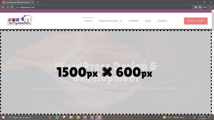
Full Page & Background Images
Full page images are as wide as the user’s screen size. People are now using larger screens at home in their WFH settings but that doesn’t mean your images need to be the maximum size. Aim instead for a middle of the road optimization based on the content of the image. I personally size my background images between 1400px – 1600px wide with an aspect ratio around 16:9. If I’m using a colored overlay, I will go often go around 1200px because the overlay often compensates for any loss in quality. It should be no more than 200kb, if possible.
I am using my website in the shown examples. The screenshot is taken from my 15″ Lenovo laptop which is a very common size screen for laptop users.
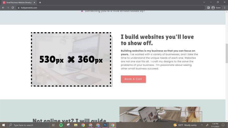
General Images
When the size of the image doesn’t span the whole page, resize the image to its largest width. In this example, the image size is 530px wide by 360px tall which is almost an image ratio of 2:3. If you don’t know exactly where an image will go yet, I recommend sizing to no larger than 800px in either dimension. It should be under 100kb.
Mobile Images
Always consider using a smaller image for mobile devices especially in the case of full background images. A mobile version can cut the size of an image by 75% and vastly improve mobile speeds. Using a page builder like Elementor allows you to easily use separate image files for the mobile version of your website. This is especially critical for full screen, background images!
Convert Images to the Optimal File Format
Choosing the right file format for your images is crucial for optimization. Different file formats offer varying levels of compression and quality, and selecting the most appropriate one can drastically reduce file sizes.
JPEG is best for photographs and images with many colors. They have a small file size but they do not work for images that have transparency.
PNG is suitable for images with limited colors or transparency, like logos or graphics. It is generally a larger file size so avoid using it for high-quality photographs or images with many colors.
GIF is ideal for simple animations or images with limited color depth, such as icons. This is not for high-quality photographs or images with many colors.
WebP is a modern format with excellent compression and quality. It works with transparency and is fantastic for lowering the file size of large hero or background images. Use it if your website’s target browsers support it, but avoid it if you need compatibility with older browsers.
Choosing the appropriate format based on the image content and requirements can significantly optimize file sizes and improve website performance. If you like tables, here’s a quick sum up:
| When To Use | When NOT To Use | |
| JPG | For photographs and images with complex colors. | Images that need transparency or low |
| PNG | Use with transparent graphics like logos or overlays. | Not for photographs or complex colors |
| GIF | For simple animations | Anything not animated |
| WebP | Use with very large images that need extra compression | With application that use older/non-compatible browsers |
| SVG* | For icons or logos, vector files | Photography |
Compress, Compress, Compress
Image compression is an essential step for reducing file sizes without sacrificing visual quality. How do you compress an image? I upload my images to either of these two websites and then re-download the newly compressed image. Simple as that.
However, there is a bit of a balance between file size reduction and image quality when compressing images. Aim for a balance that minimizes file size without introducing noticeable degradation. Not every image needs to be crystal clear. With CloudConvert, you have a little more control over the level of compression.
Use a Content Delivery Network (Optional)
A Content Delivery Network (CDN) is a network of servers distributed across various geographic locations. By storing copies of your website’s static content, including images, on multiple servers, a CDN can deliver content more efficiently to users worldwide.
CDNs can help optimize image delivery by reducing the amount of time it takes to load your images. When a user accesses your website, the CDN serves images from the server closest to the user’s location, minimizing the distance the data needs to travel and accelerating load times.
CDN usage can be particularly beneficial for websites with a global audience or those that experience high traffic volumes. It ensures faster image loading and a smoother browsing experience for your users.
Many web hosting providers, especially those with Managed WordPress plans, include a CDN with your plan so take a look to make sure it’s activated.
Have any questions?
I know this is a lot of information to consume but once you become more familiar with the process, it becomes second nature. Your website server and website visitors will thank you!